

.svg)

It’s a mobile-first world—and every marketer with a pulse has probably heard this 10 times today. It seems like everyone realizes the importance of mobile, so why do so many mobile experiences still stink?
From B2B behemoths to retail giants, bad mobile sites still litter the internet. If yours isn’t great, it’s turning customers to your competition and could even damage your search ranking. Here are 5 signs of a bad mobile experience you need to look out for (and fix) to keep your customers clicking and calling.
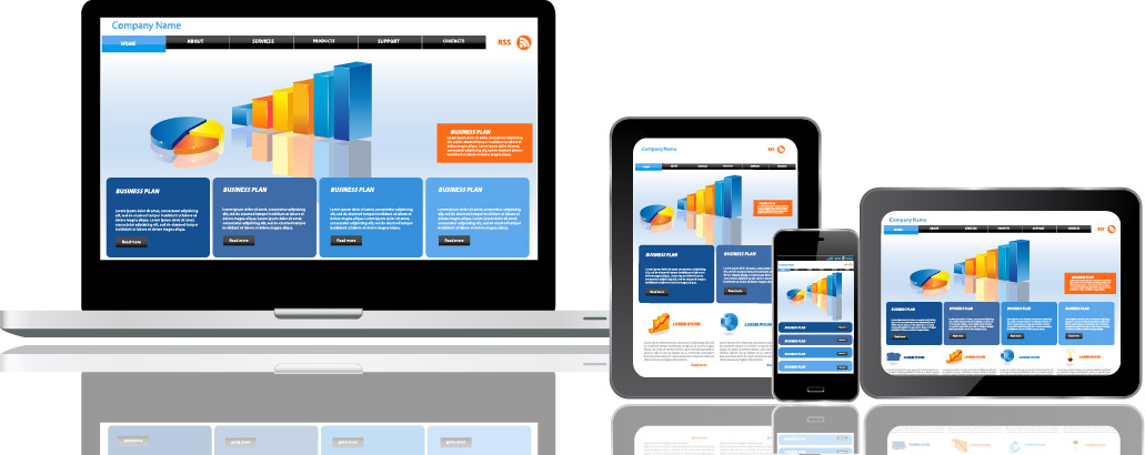
Non-Responsive Site Design
Do we seriously have to talk about this in 2018? Apparently so. It’s mind blowing how many tech-focused B2Bs and large retailers still aren’t using proper responsive web design. Google started penalizing the search ranking of non-responsive web pages back in 2016, and that should have been enough of a wake-up call for any company that has the budget to roll it out. If your website isn’t responsive, most of your potential mobile customers will leave. According to research by Adobe, 8 in 10 of consumers stop engaging with content that doesn’t display well on their device.
Slow Loading on Mobile
A website that loads quickly and smoothly on a powerful desktop computer hooked up to gigabit broadband may load at dial-up speeds on a 4G mobile device. The most common reasons for slow web page loading on mobile devices are:
- Poor image optimization
- Use of Flash elements
- Too much external media
- Discount site hosting
Remember, mobile users are not the patient sort. Web pages that load just ONE second faster can see a 27 percent increase in conversion rates. Periodically test your mobile site speed, keep your designs simple, and you’ll make your mobile users happy.
Your Phone Number is Hard to Find
If you are in a considered purchase category like insurance, financial services, or home services it’s highly likely that your customers will want to call you. A click-to-call button or link should be on every page of your mobile site to make it a one-click affair for mobile shoppers to call you when it’s decision making time. And don't forget about adding click-to-call to your Google search campaigns and ads to capture customers who might not make it to your website. Phone calls have 30 to 50 percent conversion rates compared to only 1 to 2 percent for clicks, so you want to make it as easy as possible for mobile consumers to get you on the phone. Whatever you do, don’t bury your number on a contact page unless you really, really don’t want customers to call.
Annoying Ads and Pop-ups
Interstitial ads that cover the whole screen are probably the worst offenders on mobile. While they might be a good way to get people to sign up for your newsletter or get a coupon on a desktop site, on mobile they are just infuriating. They are often hard to dismiss on small screens, and once again, if it takes more than a second to get back to business, you can say bye-bye to that customer. Animated ads and pop-ups aren’t just annoying, they crowd out valuable screen space and slow page loading. Mobile ads still have a place on your site, just be judicious with their application. If it annoys you, it annoys everyone else, too.
Mobile Search is Hard to Use
High-intent customers will want to use search functionality on your website, particularly on ecomm-based sites. Your mobile search window should be large and above the fold to make it easy for customers to search on your website. If you have it hidden behind a “spyglass” or otherwise require extra clicks to find it, it won’t get used and you’re missing out on easy conversions. Of course, your search should also return relevant results with pictures, prices, and links to other relevant items.
People Will Remember the Mobile Experience
If you have a great mobile experience, you will convert more customers and keep them coming back. If you don’t, well, Google found that if consumers have a negative experience on mobile, they are 62% are less likely to purchase from that brand in the future. The bottom line: optimizing your mobile experience is a fairly simple way to keep customers coming back.
Watch this video to see how Allstate uses Invoca to improve its mobile experience and achieve 3x conversion rate on the phone vs web forms.
.svg)
.svg)